Can you understand how things are trending in ten seconds or less? Can other people in your organization understand these trends as well?
Do you employ any metrics to track this trend?
...
At the point I am at in my career, in addition to doing technical things, I also manage projects. When I first started managing projects (several jobs ago) the thing that I really wanted was a way to understand, in ten-seconds or less, was how the project was trending. I am somebody who believes that some metrics are very useful, and this is a metric that I really wanted.
I knew that the information that I wanted to understand was ultimately stored in the bug-tracking system that I was using, but I simply could not find any pre-packaged solution that gave me what I wanted.
So, I hacked together my own solution.
My solution basically consists of a "cron" job that queries the bug-tracking system for its data. I run this cronjob every morning at 12:05am.
What I do is as follows: I organize projects by milestones, and I track bugs by the milestone that they need to be addressed by. How all of this works at a given jobsite varies from company to company. But the essential point is that all of the bugs are organized by clear milestones.
Then, every morning at 12:05am, my cronjob runs, querying the bug-tracking system for its information. Generally, I think that looking at the previous 45 days worth of data provides a reasonable view of how a project is going, so my scripts default to using a 45-day window.
And then....my scripts produce graphs...one per milestone that I am interested in. One of the first things I do every morning when I get into work is to look at these graphs. I also publish these graphs so that everybody in the organization can see and understand these. I am, after all, a big believer in transparency.
Having this system run automatically at night is a win for me, because it gives me more time to do actual technical things during the day. I simply do not have time to futz with graphs every day.
I'll show you some examples of these graphs, but before I do, I have to issue the following disclaimer: ALL OF THE DATA THAT WAS USED TO GENERATE THESE GRAPHS IS FAKE.
Seriously, the data is fake, OK? Trust me.
So, here is an example:
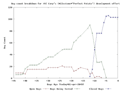
 So, what we have here is a project in which ~100 bug tickets were written. Some of these tickets might have corresponded to feature requests and some of these tickets might have corresponded to actual bugs in the project itself. The graph here clearly tells how the work towards this milestone went overall: roughly 45 days before "01-apr-2049", work started in earnest. Work on the project started slowly, but then things picked up. If you consider the fact that the number of "Open Bugs" appears to be relatively constant over time and the number of "Bugs Being Tested" appears to be increasing greatly over time, then you can easily deduce two things:
- during this time, the number of new bugs being written against this project/milestone was roughly equal to the number of bugs being "fixed" and sent to SQA for testing.
- SQA was getting a little bit backed up with tickets that they needed to test and verify...but this doesn't seem to have been a big deal because SQA seems to have had the capability to test/verify/close a large number of tickets in a short amount of time.
Here is an example of another graph:
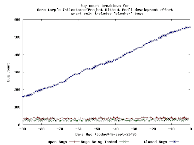
 This is a much different graph than the previous graph. There are two things that I would like to immediately point out about this graph: this graph only includes tickets that have been deemed to be "blockers" to the release and also the window that this graph depicts has been increased to three months.
The addition of the "blockers" criteria is something that I have added to my reporting tools. My thinking is that, at some point in a software release, the whole organization needs to just concentrate on blockers and nothing else. Hence, my reporting tools offer this capability.
I have increased the reporting window here to ninety days to better illustrate the points that I will make next.
There is something very likely wrong with a development effort that produces the preceding graph. The number of open "blocker" bugs never trends towards zero, and neither does the number of "testing" bugs. It should be very easy to understand the following point: unless and until these two lines reach "zero", the organization cannot complete its software release. Even more troubling than this is the fact that the number of "closed" blockers is constantly increasing, which indicates that there is a constant stream of "blocker bugs" being found and fixed...for nearly three months.
How serious is all of this? Well, it depends on THE SCHEDULE, of course. In my experience, three months is a long time to be working on a single milestone, so, if I were to see a graph like this, I'd be pretty concerned.
...
These graphs are a (trivial) invention of mine, and I find them to be useful in my work in managing projects. I hope that others find this technique to be useful!
....
Update: naturally, soon after I published this, I learned that this is type of graph has an official name: burn down chart. I continue to find these charts to be useful in my own planning and management.
No comments:
Post a Comment